Custom features
The following custom features are available to all Sellers. Speak to your Account Manager or contact us to switch them on.
These features are also available if you use one of our plugins.
By default, we pay you as soon as your customer completes checkout. But sometimes you need to confirm stock, fulfil an order or verify goods before receiving payment. Flexible payouts let you do that. We’ll hold the payment for a period you set (in hours). During that time, you can either confirm the order to trigger payout, or cancel it.
Common use cases: drop-shipping, made-to-order goods or any scenario where you can’t guarantee fulfilment at checkout.
If the business name on your iwocaPay account doesn’t match the brand your customers know, you can set a custom trading name. This is what customers will see during checkout.
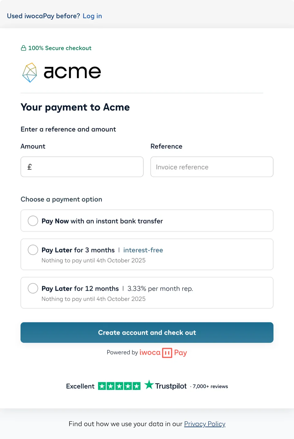
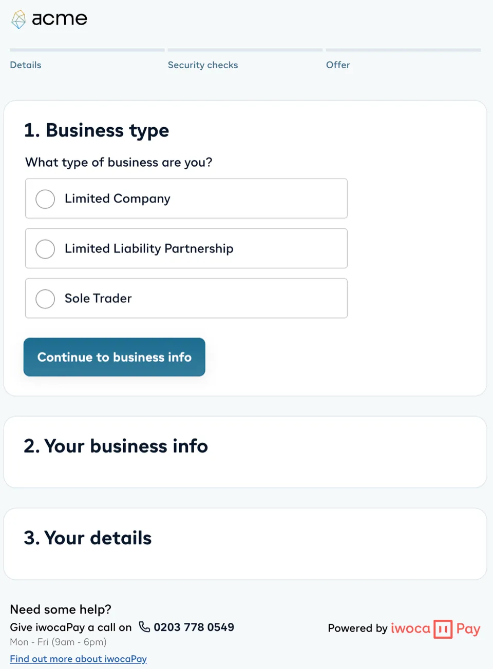
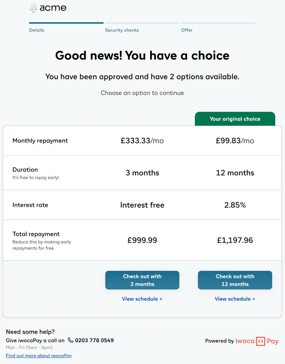
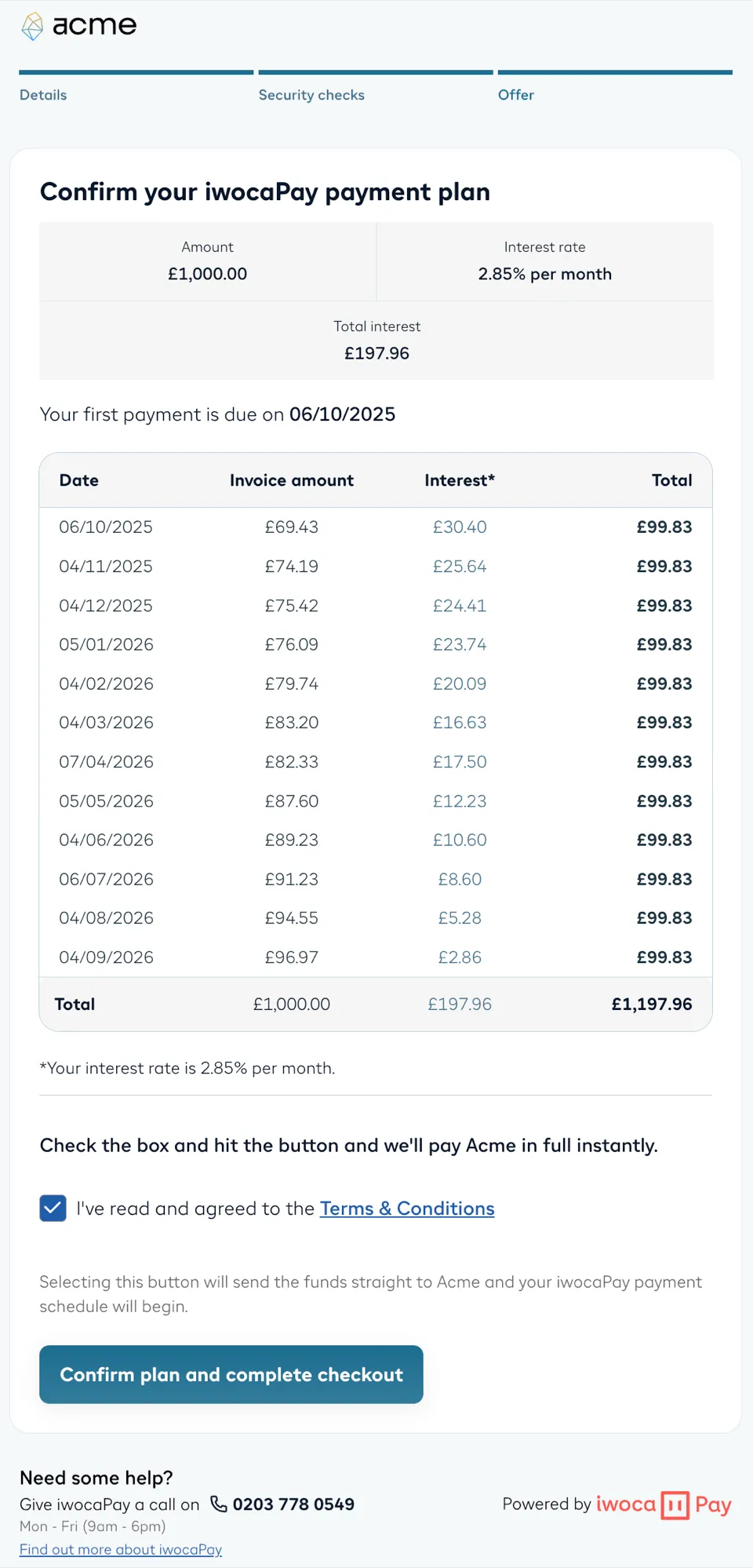
You can make the iwocaPay checkout look and feel like part of your site through co-branding. This will result in your logo and brand colours being added to our checkout.
We’ll do all the heavy lifting - you just need to send your account manager:
- Your primary colour (HEX code) - we’ll add it to the key buttons
- Your logo (SVG) - we’ll add it to the top of the checkout
Key questions, answered:
- I have multiple websites, can I use different branding per site? No, we are unable to use different branding per site. You can only show one logo and one colour.
- I have several brand colours, can I have multiple? No, you can only use one primary colour. Please see the colour guidelines below.
- Will the branding be visible throughout the whole application journey? Yes, it appears on every page of the checkout, please see screenshots in the ‘logo guidelines’ below
Please follow the below guidelines for the colour and logo:
Your brand colour will be used for important buttons (CTAs), so it’s important to choose carefully. You can only choose one colour, so make sure it matches your brand best (or matches the buttons on your website).
✅ Good examples
- Strong, professional colours with good contrast on white (e.g. navy blue, dark green, deep purple)
- Colours that feel consistent with your brand identity
❌ Avoid
- Bright red or bright orange (can imply warnings or errors)
- Very light colours (low visibility, especially on white backgrounds)
- Colours that might feel untrustworthy, confusing, or inappropriate for CTAs
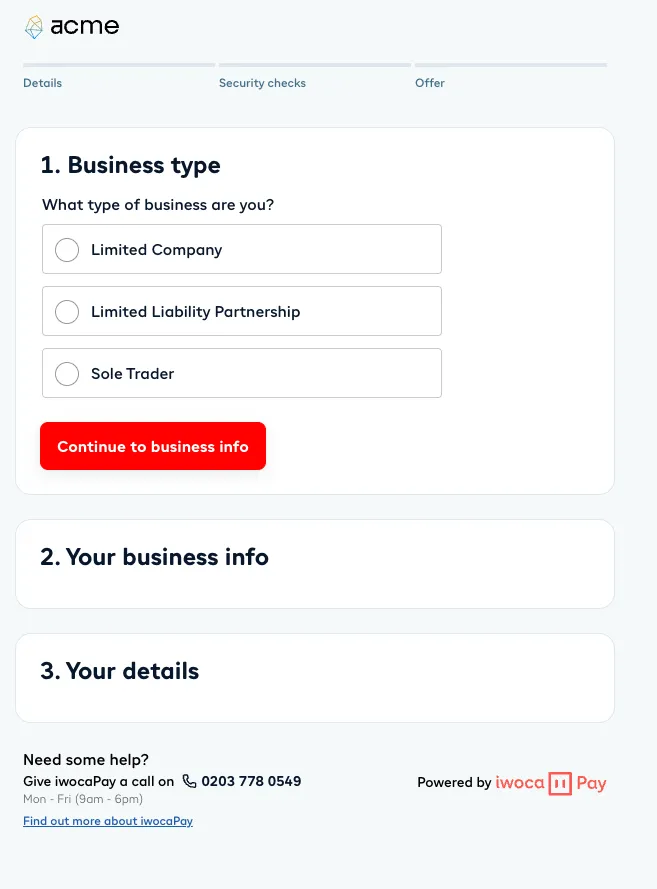
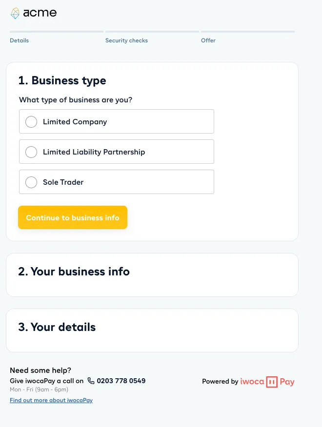
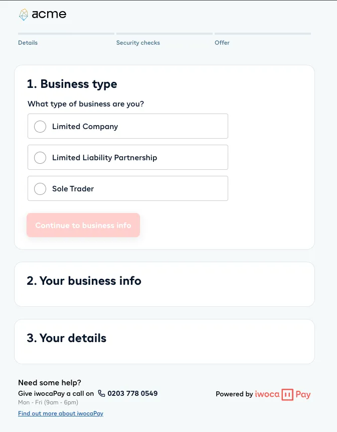
Your logo is the most recognisable part of your brand, keeping it simple helps it shine in the checkout journey.
✅ Good examples
- Use your cleanest, simplest primary logo
- SVG format for sharp, scalable rendering
- Rectangular or square format
- Designed for visibility on a white background
❌ Avoid
- Logos with lots of padding (they won’t sit well in the layout)
- Busy, detailed secondary/alternative logos
- Colour palettes that clash with your chosen primary colour